Widget Configuration
Controls how the chat widget looks and introduces itself on your storefront - name, icons, images, tooltip text, tone, and access rules.
Branding
-
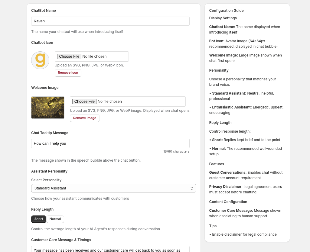
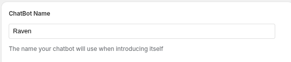
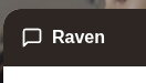
ChatBot Name: The display name your assistant uses when introducing itself to customers.
-
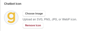
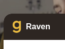
ChatBot Icon: Upload an SVG, PNG, JPG, or WebP avatar (shown as a circular icon in the chat bubble). Use "Remove Icon" to revert to the default.
Welcome Messages
-
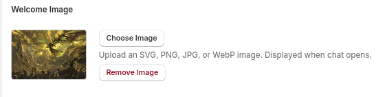
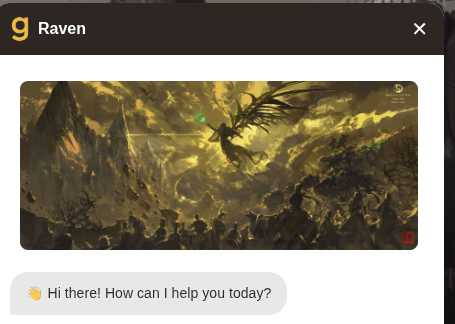
WelcomeImage: A larger image displayed the moment a customer opens the chat window. Accepts SVG, PNG, JPG, or WebP.
-
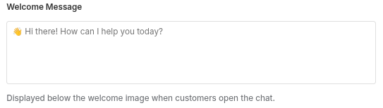
WelcomeMessage: The greeting message seen by the customers.
-
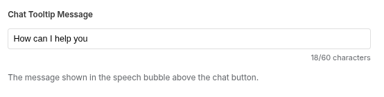
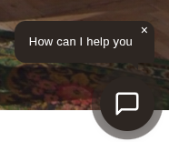
Chat Tooltip Message: The short line shown in the speech bubble above the chat button (e.g. "Got any questions? I'm happy to help."). Limited to 60 characters, with a live counter and warning when the limit is reached.
-
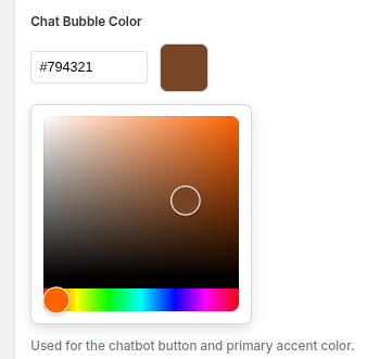
Chat bubble color: The color theme used by the chat widget , you can customize it based on your stores color theme.
AI Personality
-
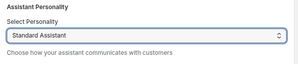
Assistant Personality: Choose between Standard Assistant (neutral, professional) and Enthusiastic Assistant (energetic, upbeat) to match your brand voice.
-
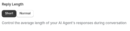
Reply Length: Set replies to Short (brief and to the point) or Normal (the recommended, well-rounded default).
Customer Care Message
-
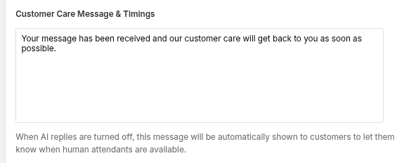
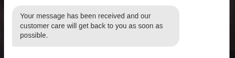
Message & Timings: The fallback message customers see when AI replies are turned off - typically used to communicate human support hours (e.g. Mon–Fri, 8am–10pm). To learn more about customer messages go here.
Behavior & Access
-
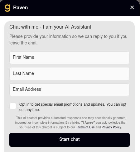
Allow Anonymous Users: Lets visitors chat without providing a name or email first.

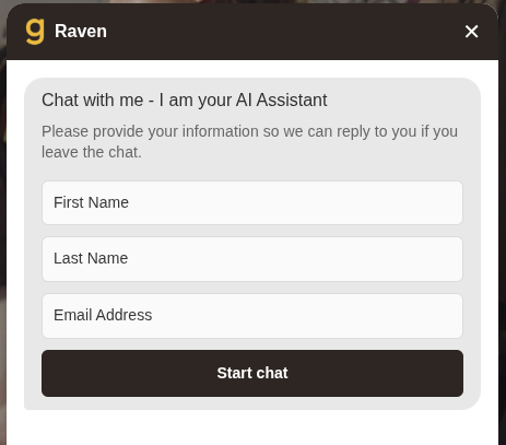
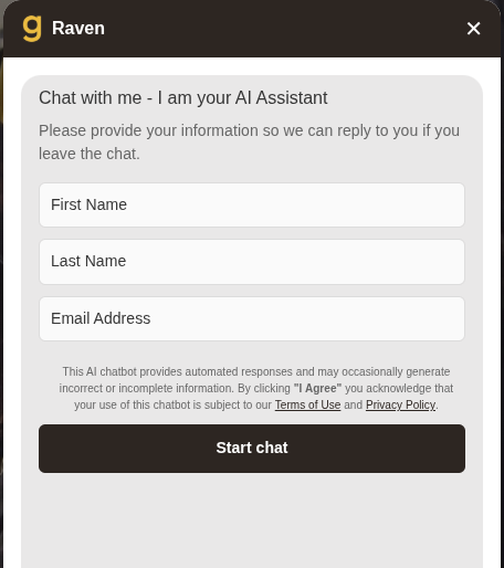
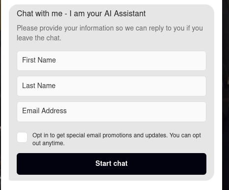
Disabling this setting will have the chabot make the customers fill out a Information form
-
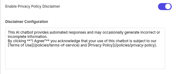
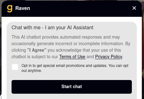
Privacy Policy Disclaimer: Requires customers to accept a legal disclaimer before chatting. Enabling this reveals a text field for the disclaimer copy (e.g. "By clicking I Agree you acknowledge...").
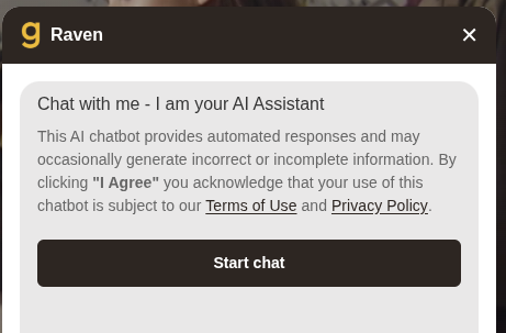
If used with guest users disabled
-
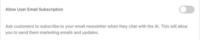
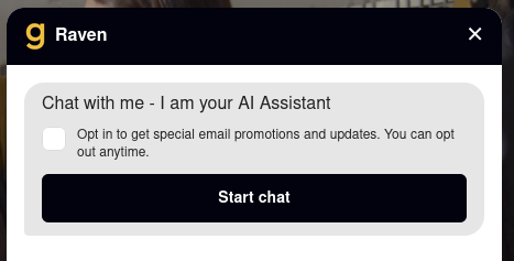
Allow User Email Subscription: Prompts customers to opt in to your email newsletter during the chat, so you can send marketing updates.
When user is logged in
When user is logged in with disclaimer on
When used with guest users disabled
When used with guest users disabled and disclaimer on
-
ChatBot by Default on Desktop: Controls whether the widget opens automatically or stays collapsed until clicked on desktop screens.